Every company has information that they need to communicate to other businesses or consumers and yet may not always have access to professional graphic designers. Whether it’s due to time or money limitations often companies turn to a non-designer to step in and be the hero who saves the day by designing an effective flyer, brochure, webpage, or any number of promotional materials. The results however are typically sub-optimal.
If it is you who happens to be staring destiny in the face and are tasked to take on a design project with no design experience don’t panic. Here are some basic design tips for non-designers that will get you going and help you be the hero of your story:
1. Keep it Simple
Focus on the message, don’t add extra copy, images, or effects like drop shadows if they don’t add to the piece. You only have a short amount of time to catch your audience’s attention. Don’t waste that time by having them sift through the clutter to find your message, because they won’t.
2. Know Your Medium
Knowing the specs of where your design will be displayed will save you time and allow you to plan and achieve a better outcome. Every medium has its pros, cons, specs, and best practices, consider all these when planning and laying out your design. You don’t want to waste your time and effort designing a piece to find out it won’t work where it is supposed to.
3. Use Quality Images
Bad photographs and imagery look awful, can detract from your message, and make your company look bad. Use relevant images. You can take your own images or pay for good stock imagery.
It is obvious to everyone if you steal images, they have watermarks or are low quality on purpose. Don’t steal and use these, people notice, and it reflects poorly on you and your company. You can also get in legal trouble if you steal images and use them as your own, don’t do it.
If you take your own images, stage the shot with good lighting and background. Make sure that the images are consistent, size, proportions, lighting, treatments, etc…. Whatever you do, don’t use bad, poorly lit images. And under no circumstances should you cut off part of the main subject of the image.

High-quality imagery can make a big difference in your design efforts.
4. Be Consistent
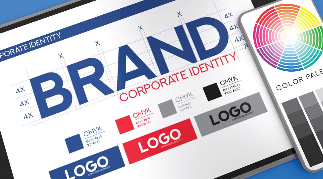
Use your brand’s logos, colors, fonts, iconography, and style. You want whatever you are designing to be quickly associated with your company and it’s brand. If there are previous materials like the one you are attempting to make, use those as a template. This will help you maintain consistency and save you time.
5. Search the Internet for Examples, Inspiration, and Even Templates
Let’s face it, if this were an important enough of a design like a logo, you’d hire a professional. Most likely the design you are working on is a flyer, email, or webpage that is meant to temporarily convey a message. No one will fault you for not being original and creative. There are resources out there to help you, use them.
6. Hierarchy
This should be obvious, but I would be remiss if I didn’t mention it. Separate the content into how important it is and treat it as such. Make the main message or headline stand out, make it bigger, and maybe add some color. Let the supporting information be smaller yet still easily readable. It is the headline or main message that will draw the viewer in, and if they are interested enough, they will read the rest.
These are a few of the many tips to get you headed in the right direction. So now go hero, make that design and rest easy that you will do a good job.
![20250616_SPW_SEOSmallBizGuideCTA • Sharp Wilkinson Boost Your Online Visibility! Unlock the secrets to a top-ranking website with our FREE SEO Guide for Small Businesses. [Download Your Guide Now!]](https://sharpwilkinson.com/wp-content/uploads/2025/06/20250616_SPW_SEOSmallBizGuideCTA-1024x512.png)


