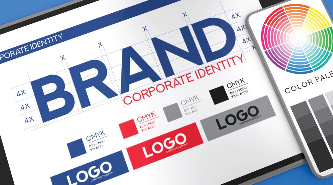
More Color Doesn’t Equal Better (Usually)
Too much color in a logo (or any design for that matter) can easily overwhelm and undermine the intended visual focus.

Too much color in a logo (or any design for that matter) can easily overwhelm and undermine the intended visual focus.

Your company needs signage and branded promo items and you’ve been charged with the design and preparation of art files for print. Where do you start?

There are many graphic design conventions out there. Some are more appealing to this designer than others. Here are five of them.

Communicating information to customers is tricky and especially if you don’t have professional designers on hand. What can you do? Here are six tips:

The em dash is a punctuation mark so versatile that it can easily be used in place of commas, parentheses, or colons. But, why is it so underutilized?