In the modern age of internet searches, e-commerce, and inbound marketing, we exist in a time in which all three roads have gloriously met at one intersection and seem to be bound for the foreseeable future. The vehicle through which businesses (especially small businesses) need to get and stay on this road to the future is a rather obvious one: a killer website. But when it comes to designing a new website (or renovating an old one) knowing what to do is just as important as knowing what not to do. Here are five common mistakes we see small businesses make on their websites:
1. Too many links
There’s a delicate balance when it comes to links on your website: you don’t want too few, but you definitely don’t want too many. I tend to err on the side of having fewer links which makes for a more streamlined experience. Obviously, having a website that appeals to search engines is important, but so is having a site which can be easily navigated. Look, a statistic like time on page is great, but like all statistics, it needs to be put into the right context. If the time on page stat for your homepage is high, but it’s lackluster on your other pages, this may be a sign that people are getting lost on the homepage. You want people to be able to find what they’re looking for, otherwise, the user experience is an exercise in frustration because your user interface is confusing. No one likes that.
2. No conversion paths
Allow me to create a theoretical. Let’s say your website is attracting daily traffic and there’s one visitor who is particularly enjoying your content to the point he wants to get in touch with you about potentially buying from you, but he has no easy way to let you know he’s interested. You may as well chalk him up as a loss.
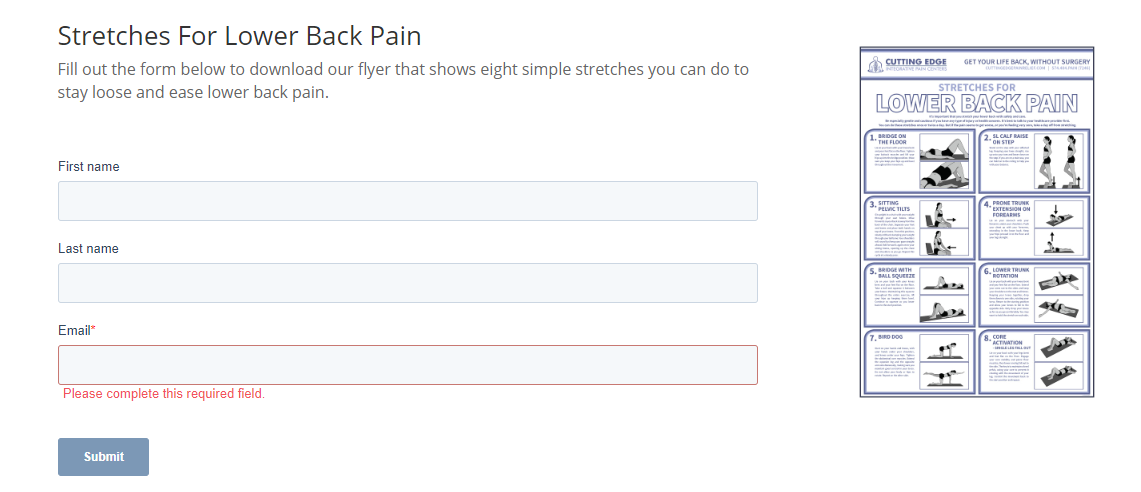
Now, imagine this same story with a different second act: instead of making it challenging for the prospect to contact you, your website is armed with conversion paths and CTAs; now your visitor has the opportunity to tell you about his interest and you know exactly what piece of content convinced him to contact you, and if you use a CRM like HubSpot, you get to know the pages he visited in the lead-up to his decision. Conversion paths to gated content give visitors what they want–more content to take with them–and what you want–information about a prospective customer. Sounds like a win-win to me.
 Convert a visitor into a lead with a webform CTA.
3. Ignoring the Buyer’s Journey
There are three distinct phases of the buyer’s journey: the awareness stage, the consideration stage, and the decision stage. We’ve written about this topic before, but there’s a reason why we put emphasis on it–it’s crucial. Understanding who your potential buyers are, what their problems are, and how you can help solve them meets your prospects where they are, which also creates a stronger connection. Buyers want to purchase from companies that understand them, so if your website assumes visitors are already at the decision stage, you seem more interested in selling to them than helping them–which is almost certain to scare them away. Instead, create website content which appeals to and targets buyer’s at the top, middle, and bottom of the sales funnel to earn your visitors’ trust.
4. Poor Mobile Optimization (or worse: none at all!)
A lot of people carry a smartphone… actually, that’s a massive understatement. Pew Research says that as of February 2019, 81% of American adults report owning a smartphone. Over half of all Google searches are now conducted via those annoying yet necessary buzzers in our pockets. Here’s another stat: 40% of users have gone to a competitor’s website after a poor mobile experience, which means your SEO efforts may well be for naught. You could be the first result in every Google search in your industry–which constitutes years of hard work–but if your mobile website isn’t properly optimized, then your competitors who perform worse on search engines benefit. Make your competition earn their traffic, don’t just hand it to them in the form of a bad mobile experience on your website.

Your website should be designed for a good visitor experience on both a computer and on mobile device.
5. No blog
This is a big one and it really ties it all together. Not having a business blog or one that isn’t updated consistently is a missed opportunity. Blogs are a great way of establishing your organization as a thought leader in your industry and if your marketing strategy is built on content creation, blogs should be a built-in part of that strategy. Your blog is also a great way of achieving high ranks in SEO: you can often reach your audience by optimizing your blogs for what potential customers are looking for. Write your blogs with the different stages of the buyer’s journey in mind and place CTAs to match.
Your website is the key to your company’s future, so don’t lose that bright future because of a bad website. Much like your company’s logo, you probably shouldn’t DIY your company’s website simply because there’s too much at stake. The foregoing five mistakes are far too common and making even one of them can cause your organization a world of hurt in the near–and approaching–future. Yes, building a website may be expensive, but the return on that investment will pay dividends.
![20250616_SPW_SEOSmallBizGuideCTA • Sharp Wilkinson Boost Your Online Visibility! Unlock the secrets to a top-ranking website with our FREE SEO Guide for Small Businesses. [Download Your Guide Now!]](https://sharpwilkinson.com/wp-content/uploads/2025/06/20250616_SPW_SEOSmallBizGuideCTA-1024x512.png)


